Colour palettes in homes work by organising colours into three distinct roles: a dominant colour covering the majority of a room, a secondary colour supporting it, and an accent used sparingly. This traditional rule creates automatic visual balance without requiring any design training. The system only holds together, though, when the colours share consistent undertones. A warm cream wall next to a cool grey hallway creates visual tension regardless of how individually attractive each colour is. Get the undertones right, and the palette flows. Get them wrong, and no amount of careful furniture selection will fix it.
How colour palettes work in homes: the core principles
Understanding the mechanics behind interior colour harmony starts with three properties every colour possesses: hue (the colour family itself, such as blue or green), saturation (how vivid or muted it appears), and value (how light or dark it reads). Professional decorators manipulate all three to build palettes that feel intentional rather than accidental.
The 60-30-10 rule is the most reliable framework for applying those properties in practice:
- Dominant colour (60%): Walls and large furniture pieces. Usually a neutral, warm white, greige, or soft grey that creates the room's backdrop.
- Secondary colour (30%): Curtains, rugs, accent chairs, or cabinetry. A richer tone that complements the dominant without competing with it.
- Accent colour (10%): Throw pillows, artwork, ceramics, and decorative objects. The boldest colour in the room, used sparingly to draw the eye.
Undertones are the hidden layer most homeowners overlook. Every paint colour carries a subtle underlying hue, warm (yellow, orange, or red) or cool (blue, green, or purple), that becomes far more visible once the paint is on the wall and surrounded by your actual light and furnishings. A "neutral" greige can read lavender or pink depending on its undertone and the light hitting it.
Natural and artificial lighting both shift how colours appear. North-facing rooms receive cool, blue-tinted light all day and benefit from warmer paint tones to counteract that effect. South-facing rooms get warm, bright light and can balance cooler tones well. Artificial bulb temperature matters equally: warm white bulbs at 2700K make warm paint colours glow, while daylight bulbs at 5000K do the opposite.
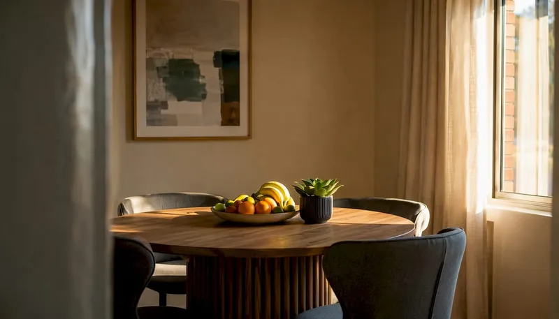
A monochromatic palette, using shades and tones of a single hue, produces harmony and depth without colour clash. Analogous palettes, built from colours adjacent on the colour wheel such as blue, blue-green, and green, feel naturally cohesive because they share undertones. Complementary pairings, colours opposite each other on the wheel, create energy and contrast but require careful proportion management to avoid a jarring result.
Common mistakes in home colour palettes and how to fix them
Most colour palette problems trace back to a handful of predictable errors. Recognising them before you buy a single tin of paint saves both money and frustration.
- Too many unrelated colours. A whole-home palette of seven or more unrelated shades reads as chaotic. Limit the palette to 3–5 colours total, including dominant, secondary, trim, and accent. Repeating a tight palette across rooms creates a far more intentional result than scattering unrelated shades through each space.
- Mixing warm and cool undertones in connected sightlines. A warm beige wall flowing into a cool grey hallway creates visual friction that no amount of styling can resolve. Choose a side, warm or cool, and commit to it throughout all connected spaces.
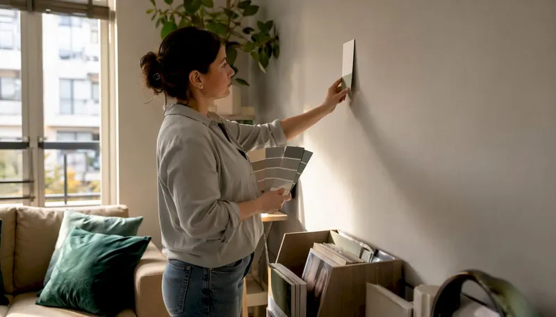
- Skipping sample testing. Paint colours can shift by more than 20% depending on light source, time of day, and whether the light is natural or artificial. A colour that looks perfect on a chip in the shop will look entirely different across four walls in your home.
- Ignoring the 60-30-10 ratio. Using two strong colours in equal proportions produces a room that feels unsettled. One colour must dominate. The 60-30-10 split prevents any single colour from overwhelming the space.
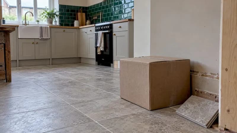
- Overlooking fixed elements. Mismatched undertones between paint and fixed finishes like flooring, countertops, or cabinetry cause colours to appear muddy or "off." Warm honey oak floors need warm-undertone paint. Cool grey tile calls for cool-undertone walls.
- Mixing clean and dirty colours. Clean colours (crisp, pure hues without grey or beige mixed in) and dirty colours (muted, earth-toned shades with grey or beige added) create completely different atmospheres. Walking from a room decorated in clean colours into one decorated in dirty colours feels jarring, as though you have stepped into a different house entirely.
Pro Tip: Before committing to any colour, hold your paint sample next to a true white sheet of paper in daylight. The undertone will reveal itself immediately, showing whether the "neutral" you have chosen leans pink, green, yellow, or purple.
How to develop a cohesive colour scheme for your whole home
A whole-home palette works best when it is built systematically from one anchor point outward, rather than chosen room by room in isolation.
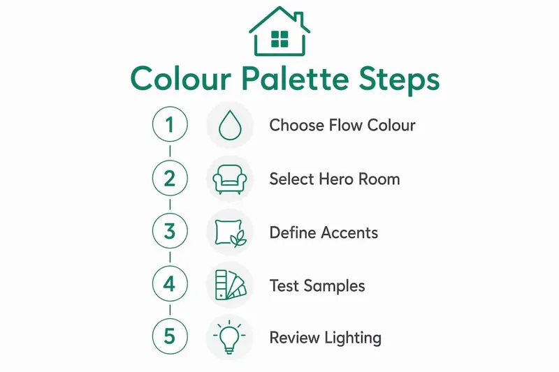
Start with a flow-space colour. Hallways, foyers, and open-plan connecting areas benefit from a consistent neutral that acts as a visual thread. Using a neutral flow-space colour in these connecting spaces anchors the home's palette, allowing more distinctive colours in enclosed rooms without losing cohesion. Warm whites, greige, and soft taupe all work reliably here.
Choose a hero room next. Select your most-used, most-visible space and design its full palette first. The hero room sets the undertone family for the rest of the home. Every other room should share that warm or cool undertone, even if the specific colours differ.

Build from a hero item. Starting palette decisions from a beloved piece, such as a favourite rug, a piece of artwork, or a statement fabric, ensures the colours you choose already have a harmonious relationship. Andrea Magno, director of colour marketing and design at Benjamin Moore, recommends building the palette around one colour family or two to three adjacent families on the colour wheel, then layering light to dark variations within those families for smooth room-to-room transitions.
The practical steps look like this:
- Select one dominant neutral for main living areas and hallways.
- Identify its undertone (warm or cool) and keep that undertone consistent across all rooms.
- Choose 1–2 secondary colours that complement the dominant and share its undertone family.
- Pick one trim colour for all doors, ceilings, and mouldings throughout the home. Off-white shades are the most versatile choice.
- Add accent colours sparingly, applying the 60-30-10 rule to keep them as focal points rather than competing elements.
- Repeat each accent colour at least three times across the home to build visual connection without monotony.
Experts recommend limiting whole-home palettes to a modest number of colours in total to maintain cohesion. Larger homes can accommodate more, but the principle of shared undertones applies regardless of scale.
Pro Tip: Avoid choosing colours in isolation. Place all your paint samples together on a single board and view them simultaneously in the room's actual light. Colours that looked compatible in the shop often reveal undertone conflicts when seen side by side.
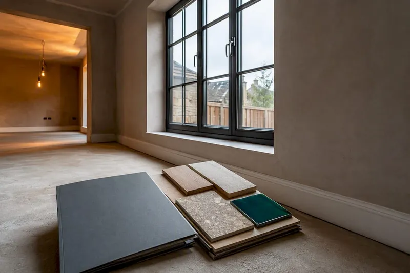
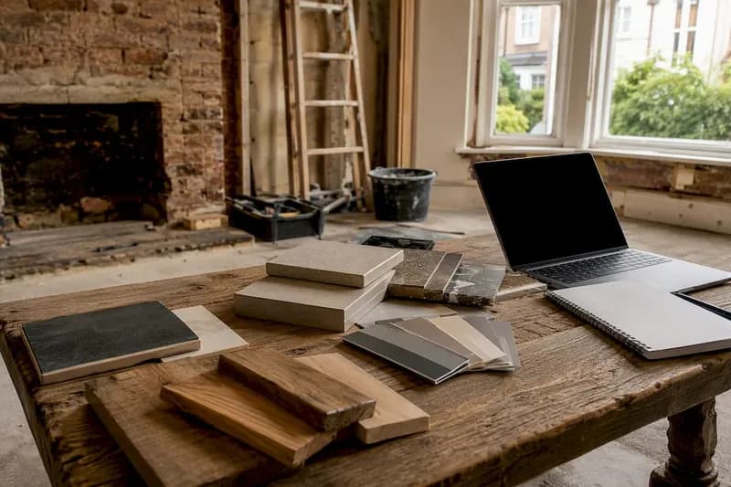
You can also use a renovation mood board to map out your palette visually before committing to any purchases, which makes undertone conflicts far easier to spot.
Applying colour palettes across rooms: lighting and purpose
Room function and light direction are the two variables that most directly determine which colours will succeed in a given space. Choosing colours without accounting for both is the single most common reason a palette that looked perfect on paper fails in practice.
How light direction shapes your choices
- North-facing rooms receive cool, indirect light all day. Warm paint tones, creams, warm whites, and soft yellows, counteract the blue cast and prevent the room from feeling clinical.
- South-facing rooms get warm, bright light for most of the day. Almost any colour works here, including cooler tones that would feel cold elsewhere. South-facing rooms are the most forgiving orientation to paint.
- East-facing rooms have warm morning light and cooler afternoon light. Test paint at the time of day the room is most used before committing.
- West-facing rooms receive harsh, warm afternoon light that can wash out cool colours. Richer, more saturated tones hold their character better against direct afternoon sun.
Window placement and orientation affect colour perception in ways that even experienced decorators underestimate. A colour that reads beautifully at noon can look entirely different under evening lamplight in the same room.
Matching colour to room purpose
Colour psychology plays a direct role in how a room feels to live in. Cool shades such as soft blues and sage greens promote calm and rest, making them well suited to bedrooms and bathrooms. Warm tones like terracotta, mustard, and deep burgundy energise social spaces such as dining rooms and kitchens. Home offices benefit from focused, grounding tones: deep navy, forest green, olive, or charcoal all create a sense of separation from the rest of the home.
- Bedrooms: Soft blues, dusty greens, warm taupe, and muted lavender all support rest. Avoid bright whites, which can feel clinical under morning light.
- Kitchens: Lighter neutrals with subtle warmth work best. White cabinets can handle a sage green wall; dark charcoal cabinets demand warm white or pale cream walls.
- Living rooms: Warm neutrals, greiges, and soft earth tones flatter both day and evening use. Avoid cool greys unless the room has abundant south-facing light.
- Bathrooms: Pale greens, blues, and clay tones work well because the room is small enough that bolder colour reads as designed rather than overwhelming.
- Home offices: Deep, grounding tones reduce eye strain and signal focus. Bright whites reflect screen glare and cause visual fatigue over long periods.
Testing paint properly
Professional decorators advise testing paint samples of at least 12x12 inches, applying two coats and placing them on different walls to assess colour shifts across daylight and artificial light. Live with the samples for at least 48 hours, checking them in morning light, afternoon light, evening light, and under your normal artificial lighting before making a final decision.
Textures and materials interact with colour in ways that flat samples cannot fully reveal. Matte surfaces absorb light and make colours appear slightly darker and more muted. Gloss finishes reflect light and intensify colour. Coordinating paint choices with the room's existing materials, natural wood, stone, linen, or metal, adds depth that a single-colour approach cannot achieve on its own. A soft furnishings plan that accounts for textiles alongside paint colours produces far more cohesive results than treating them as separate decisions.
Pro Tip: Test paint on two walls in the same room: one near the window and one in the darkest corner. A colour that performs well in both locations is the right choice. One that only looks good near the window will disappoint you for the other three-quarters of the room.
Expert insights on colour harmony and visual flow in UK homes
The principles behind a cohesive interior palette are well established among professional decorators, and the guidance consistently points in the same direction: undertones, lighting, and sequencing matter more than individual colour choices.
The 60-30-10 rule is the most widely cited framework in professional interior design, and for good reason. It prevents any single colour from dominating to the point of visual fatigue, while ensuring the accent colour reads as a deliberate focal point rather than an afterthought. Benjamin Moore's colour experts describe the accent as "the focal point for the room," recommending that it offer clear contrast to the dominant and secondary colours rather than blending into them.
Undertone matching across fixed elements is where most homeowners encounter difficulty. Matching paint undertones to permanent home features like honey oak flooring or granite countertops prevents colour clashes and ensures the paint appears clean and balanced rather than muddy. The practical test is straightforward: identify whether your fixed finishes lean warm or cool, then choose paint that sits in the same family. A single undertone mismatch in a connected sightline can make an entire room feel visually off, even when the individual colours are attractive in isolation.
Lighting shifts compound the undertone challenge. The same paint colour can read as beige in the morning, pink at noon, and grey at night, depending on the light source and its colour temperature. Warm white bulbs at 2700K shift colours yellow; cooler bulbs at 4000K or above shift them blue. Matching bulb colour temperature to your paint's undertone family produces the most consistent result across the day.
The concept of a flow-space colour, a consistent neutral running through hallways and connecting areas, is one of the more underused tools in whole-home palette planning. It allows each enclosed room to carry its own distinct character while maintaining a visual thread that ties the home together. Interior designer Ilene Chase, speaking to interior design editors, described the reasoning clearly: "Choosing a single colour gives the house a common thread, and picking a neutral allows more flexibility with decorating."
For homeowners managing a renovation alongside budget tracking and contractor coordination, keeping colour decisions organised within a single planning system prevents the kind of costly mid-project changes that arise from choosing colours in isolation. House A-Z's platform consolidates design suggestions, budget tracking, and project management in one place, so colour palette decisions sit alongside the rest of your renovation plan rather than existing as a separate, disconnected process. Renovation projects that account for home remodelling best practices from the outset, including colour harmony, tend to produce results that hold their value and appeal over time.

Planning your renovation and want to keep your colour decisions, budget, and contractor communications in one place? House A-Z connects you with the tools and expertise to make your project feel manageable from the first paint sample to the final coat.
Key takeaways
A cohesive home colour palette depends on consistent undertones, the 60-30-10 ratio, and paint testing under real lighting conditions before any final commitment is made.
| Point | Details |
|---|---|
| Apply the 60-30-10 rule | Use 60% dominant, 30% secondary, and 10% accent colour in every room for automatic visual balance. |
| Match undertones throughout | All colours in connected spaces should share warm or cool undertones to prevent visual friction. |
| Test samples properly | Paint at least 12x12-inch swatches on two walls and observe them over 48 hours in varied lighting. |
| Use a flow-space neutral | A consistent neutral in hallways and connecting areas anchors the whole-home palette. |
| Limit the total palette | Keep the whole-home palette to 3–5 colours, including dominant, secondary, trim, and accent shades. |