Straight (grid), running bond, 1/3 offset, herringbone and diagonal cover most homes well, and the right choice comes down to one rule: let your tile's shape and your room's proportions decide, not trends. A square tile suits a grid or diagonal. A plank tile wants herringbone, brick or chevron. Below, you'll find pattern details, a choosing framework, a planning checklist and fresh inspiration.
TL;DR:
- Herringbone, chevron, and diagonal layouts require significantly more cuts and waste, often needing 15-25% extra tiles to account for angled border trimming.
- For large-format planks, the 1/3 offset pattern is recommended to evenly distribute lippage and stress points, especially in high-traffic areas.
- DIYers can confidently install straight grids, running bond, and checkerboard patterns within a weekend, but complex patterns generally need professional tilers for optimal results.
- Proper planning, including dry-layout, room measurements, and waste buffers, reduces costly mistakes and helps align pattern design with room proportions and function.
- Choosing a bold pattern should be balanced with restraint in grout color and feature placement to ensure timeless appeal and avoid trend-induced regret.
Table of Contents
- Tile layout patterns explained: a gallery of your best options
- How do I choose the right tile layout pattern?
- Planning your layout: measuring, waste and a day-one checklist
- Creative trends worth borrowing (without regretting it later)
- What House A-Z sees behind expensive tiling mistakes
- Tools and pages worth checking before you order
- Why "safe" tile choices often cost homeowners more, not less
- Sources
- FAQ
Tile layout patterns explained: a gallery of your best options
Every pattern tells a different story on the floor, and each one comes with its own rhythm of cuts, waste and skill required. Here's what you're actually choosing between.
- Straight (grid): Tiles line up in tidy rows and columns, grout lines running parallel to the walls. Works with almost any square or rectangular tile, suits kitchens, bathrooms and hallways of any size, and it's the easiest pattern for a first-time tiler to lay confidently.
- Running bond (brick, 50:50 offset): Each row shifts half a tile width from the one below, mimicking traditional brickwork. Best with rectangular or plank tiles, ideal for hallways, kitchens and shower walls, and moderately easy for DIY.
- 1/3 offset: Rows shift by a third of the tile length rather than half, which spreads lippage more evenly across long plank tiles. Manufacturers of large-format wood-look planks often specify this instead of the traditional brick offset, and it's still a manageable DIY job.
- Stepladder (vertical brick): A running bond pattern turned 90 degrees, so tiles stack vertically instead of horizontally. It visually elongates a room, working well in narrow bathrooms or beside a shower niche.
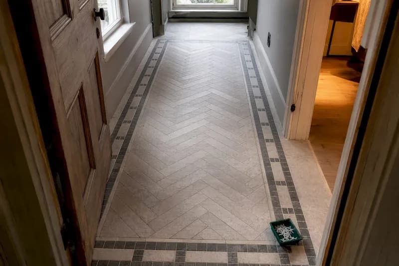
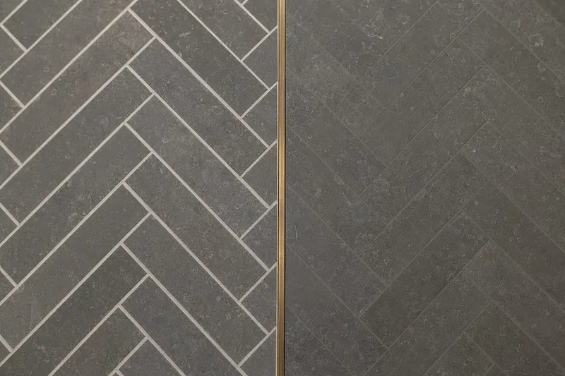
- Herringbone: Rectangular tiles interlock at right angles in a zigzag, creating serious movement and depth. It suits feature floors, splashbacks and entryways, but demands sharp cutting skills and patience, most homeowners hire a tiler for this one.
- Chevron: Similar visual energy to herringbone, but tiles are pre-cut at an angle so the zigzag forms a continuous "V" rather than interlocking rectangles. It's arguably more dramatic and needs even more precision, so it's rarely a beginner project.
- Diagonal (diamond): A straight grid rotated 45 degrees. It makes small rooms feel larger and disguises uneven walls, but every edge tile needs a cut, so waste climbs.
- Basket weave: Pairs of tiles alternate direction to mimic woven fabric, popular with small mosaic tiles in period-style bathrooms and hallways. Fiddly to align but forgiving of minor tile-size variation.
- Hexagon: Six-sided tiles tessellate naturally, giving a honeycomb look that suits bathroom floors, splashbacks and outdoor courtyards. Straight runs along walls need custom cuts, which adds time.
- Modular (Versailles): A repeating module of four or more different tile sizes, common in natural stone flooring. It reads as "random" but actually needs advance planning to keep grout lines aligned, similar to the mixed-size layouts recommended by manufacturers for large stone floors.
- Checkerboard: Two contrasting colours alternate square by square, classic in period kitchens and hallways. Simple geometry, but colour placement needs care so you don't end up with an odd tile at a doorway.
Herringbone, chevron and diagonal patterns carry the highest cutting demand, since almost every border tile needs trimming to fit. That's the trade-off for the drama they bring.
How do I choose the right tile layout pattern?
Start with the tile you already like, not the pattern. A square tile locks you into grid or diagonal layouts. A rectangular plank, closer to a 2:1 ratio, opens up herringbone, running bond and chevron. Trying to force a square tile into a herringbone pattern usually looks squashed and wastes offcuts.
Room proportions matter just as much. A layout that suits how a room actually flows will always outperform one chosen for looks alone.
- Narrow rooms benefit from a diagonal layout, which visually pushes the walls outward.
- Low-ceilinged rooms feel taller with a vertical stepladder brick pattern.
- Large open-plan floors carry herringbone or chevron well, since there's enough space for the pattern to breathe.
- Small bathrooms often suit hexagon or basket weave, where the tile size itself is already compact.
Skill level is the honest question most guides skip. Straight grids, running bond and checkerboard are realistic weekend projects for a confident DIY renovator. Herringbone, chevron and modular layouts usually need a tradesperson, particularly on large-format tile where a single bad cut ruins an expensive piece. Industry guidance consistently recommends sorting out room constraints before chasing style, because a beautiful pattern that doesn't fit your space or your skill level becomes a costly redo.
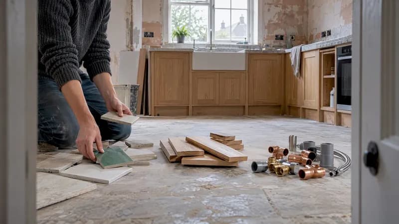
Pro Tip: If you're torn between two patterns, lay out a handful of tiles dry on the floor in both configurations and photograph them from doorway height. Patterns read completely differently in a photo than they do staring straight down at your feet.
Grout colour is part of the decision too. A contrasting grout emphasises the geometry of herringbone or basket weave; a matching grout lets a subtle pattern like 1/3 offset fade into a calmer, more textural finish.
Planning your layout: measuring, waste and a day-one checklist
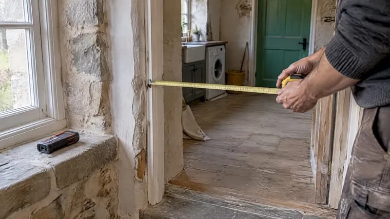
Waste allowance is where most first-time tilers get caught out, ordering exactly enough tile only to find they're four short after the first row of diagonal cuts. Measure your area, calculate square footage, then add a pattern-specific buffer on top.
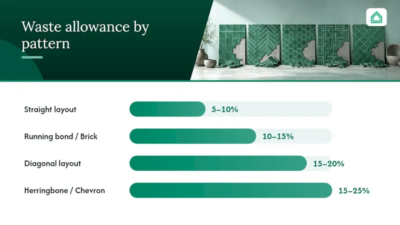
Straight layouts need the smallest cushion, typically 5–10% extra. Running bond and brick patterns need 10–15%, since half-tile cuts at row ends use up more material. Diagonal layouts jump to 15–20% because every perimeter tile is cut at an angle, and herringbone or chevron sit highest at 15–25%, reflecting the sheer number of angled cuts a zigzag pattern demands. These figures come from TilePro's pattern waste calculator, and they're worth checking against your specific tile size before you order.
Before you touch adhesive, follow these steps in order:
- Square the room from a central reference point rather than an existing wall, since most walls are slightly out of true.
- Dry-lay your key runs across the most visible part of the room to confirm the pattern reads correctly before anything is fixed.
- Mark your start line with a chalk line or laser, working outward from the centre so cut tiles land symmetrically at both walls.
- Use a pattern generator or a scaled drawing to preview cuts and get an exact tile count before you buy, which avoids both under-ordering and awkward slivers at doorways.
- Mix your adhesive to the tile manufacturer's ratio and only in batches you can use within its working time.
- Lay your first two or three rows, then stop and check levels and joint spacing before committing to the rest of the room.
Pro Tip: Never let a sliver of tile smaller than half a tile width land at a doorway or the room's focal wall. Shift your entire start line a few centimetres rather than live with an awkward offcut for the next twenty years.
Creative trends worth borrowing (without regretting it later)
Colour drenching, saturating floor, wall and even grout in one tone, is one of the strongest tile trends design writers are tracking for 2026, alongside mixing small-format tiles to create pattern purely through placement rather than a printed design, a technique highlighted by House Beautiful's design coverage.
- Frame a feature area, a hearth or a kitchen island, with a narrow ribbon tile border in a contrasting finish.
- Use a bold contrast grout to sharpen the geometry of a herringbone or basket weave layout.
- Reserve intricate mosaic patterns for low-commitment spots like a shower niche or a powder room, rather than an entire floor.
Because tile is one of the most permanent finishes in a home, designers generally recommend pairing one bold, patterned feature with otherwise restrained surfaces, so the room ages well even as trends shift.
What House A-Z sees behind expensive tiling mistakes
Most costly tiling errors trace back to the same root cause: ordering before planning is finished. Measurement and waste-calculation tools, paired with design previews and contractor collaboration features, are built to close that gap before a single tile is cut. AI agents work from your actual budget and timeline, helping catch planning errors that could become costly before they happen. Whether you're mapping a herringbone hallway or coordinating a tiler across several rooms, running the numbers first protects both your budget and your patience.
Tools and pages worth checking before you order
A pattern layout calculator previews cut counts and waste by pattern, while manufacturer guides like Daltile's floor pattern library explain centring rules room by room. For how architectural trims interact with a patterned floor, One Day Doors & Closets' design coverage is a useful reference too.
Why "safe" tile choices often cost homeowners more, not less
The received wisdom is that beginners should always default to a straight grid, and for tile shape and budget reasons, that's often sound advice. But treating every DIY project as too risky for a running bond or a 1/3 offset undersells what's actually a very manageable step up. Running bond needs the same skills as a grid, just with more attention to your offset measurement, and it transforms a flat, forgettable floor into something with real texture.
Where the conventional wisdom genuinely falls short is on waste. Guides routinely quote a single "add 10% extra" figure regardless of pattern, and that's how homeowners end up either overpaying for tile they never use or scrambling for a matching batch mid-project when a diagonal layout eats through their buffer faster than expected. The pattern you choose should shape your order quantity as much as your square footage does.
The other underrated factor is sequencing. Homeowners obsess over which pattern looks best, then treat the dry lay as an optional extra rather than the step that actually prevents disasters. A five-minute dry lay across the most visible run in the room catches problems no amount of pattern research on a screen ever will.
— Azai
Sources
- Tile Patterns & Layouts | TilePro Calculator
- Find the right tile pattern for any room | Daltile
- Creative ways designers are using tile in 2025 | House Beautiful
FAQ
What are the rules for tile layout?
The core rules are to square the room from a central reference point, dry-lay important runs before fixing anything, and plan your start line so cut tiles fall evenly and symmetrically rather than as thin slivers at doorways or focal walls.
What are the most popular tile layout patterns?
Straight (grid), running bond (brick), herringbone and diagonal are the most widely used patterns, with 1/3 offset increasingly common for large-format plank tiles.
What is the 1/3 rule in tile layout?
The 1/3 rule shifts each row by a third of the tile's length instead of the traditional half, which spreads out lippage and stress points more evenly, particularly recommended for long, large-format plank tiles.
Is it better to stack or stagger tile?
Staggered layouts like running bond or 1/3 offset generally hide minor size variations and uneven walls better than a stacked grid, though a straight stack still works well with rectified tiles cut to precise, consistent dimensions.
How much extra tile should I buy for waste?
Buy 5–10% extra for a straight layout, 10–15% for running bond or brick, 15–20% for diagonal, and 15–25% extra for herringbone or chevron, since these figures reflect how many angled or edge cuts each pattern demands.