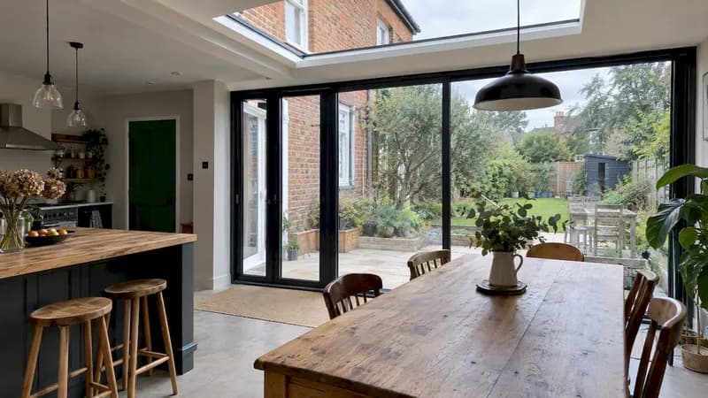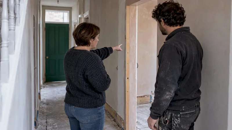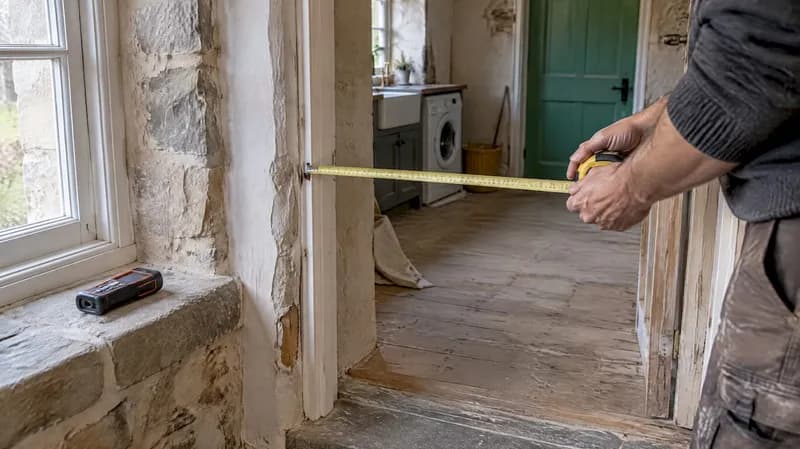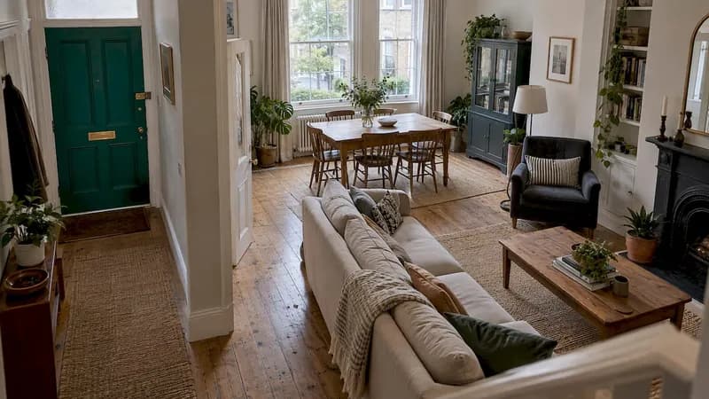
Floor plan optimisation means taking a layout, whether it is a sketch, an architect's drawing or the home you already live in, and improving how it works day to day: how you move, where you store things, how light reaches each room and how much privacy each space gives you. You do it by drawing everything to scale, testing real routines against the plan and fixing problems on paper, where changes cost nothing. This guide shows you how, step by step, with the measurements and checks that matter.
TL;DR
- Optimising a floor plan is about daily use, not just fitting more in: circulation, storage, light, privacy and zoning.
- Draw rooms and furniture to scale, then walk your daily routines through the plan before anything is built or bought.
- Keep primary walkways around 900 mm and secondary gaps no tighter than about 600 mm.
- Group noisy, wet and food-related spaces, and keep quiet rooms away from lively ones.
- Fix layout problems at drawing stage: moving a wall on paper is free, moving it on site is not.
Table of Contents
- What floor plan optimisation actually involves
- How to tell whether your layout works
- Clearances: the numbers that make a room comfortable
- Position rooms in relation to each other
- Light, windows and ventilation
- Open-plan spaces: zones without walls
- Home layout mistakes to avoid
- Improve your plan without blowing the budget
- Making layout decisions as a couple or a team
- Our perspective
- Plan your layout with House A-Z
- FAQ
- Sources
What floor plan optimisation actually involves
A floor plan is a map of how your life will run. Optimising it is a simple question asked many times: does this arrangement make ordinary days easier? Getting from bed to bathroom at 6 a.m., carrying shopping from the door to the kitchen, working from home while someone else watches television. A layout that looks generous on paper can still fail those tests.
There are two situations where people optimise:
- Before building or renovating. You have a draft plan and want to find its weak spots while changes are still cheap.
- In a home you already live in. You want to rearrange furniture, open up a room or reallocate space without major structural work.
The method is the same in both. Measure, draw to scale, place the biggest items first, check the routes between them, then look at light, storage and noise. Designers often describe the process as treating circulation, the paths you walk, as a design element in its own right. HGTV's round-up of expert space planners reports advice to consider your paths of travel and keep primary walkways clear.
How to tell whether your layout works
You do not need specialist training to assess a plan. Run through this sequence.
- Measure accurately. Wall lengths, window and door positions, door swings, radiators, sockets and any fixed items. Errors here travel through every later decision.
- Draw to scale. Paper, a CAD tool or planning software all work. What matters is that a sofa on the drawing is the size of a sofa in the room.
- Place the largest item first. In a bedroom that is the bed, in a living room the sofa, in a dining room the table. Everything else fits around it.
- Trace your routines. Draw a line for the morning routine, the cooking routine, the laundry routine. Where lines cross or squeeze through gaps, you have found a problem.
- Check every opening. Doors, drawers, wardrobes, dishwashers and ovens must open fully without hitting something.
- Mark the light. Note which walls get the most daylight and when.
- List storage. Count what must be stored in each room and where it will go.
One interior design practice puts it neatly: the most reliable test is to draw furniture at true size with the space people need around it, because a room that looks roomy as an empty rectangle can fail once a 2100 mm sofa, a king bed and a six-seater table are placed inside it with realistic clearances.
Clearances: the numbers that make a room comfortable
Most layout frustration comes down to gaps that are a few centimetres too tight. Different designers publish slightly different figures, but they cluster closely. According to Kaiko Design Interiors, primary circulation paths should be at least 900 mm, secondary clearances such as around a bed or between dining chairs and a wall can drop to 600 mm, and below that a space starts to feel compressed whatever its floor area.
Aaditya Interior's space-planning rules give a fuller set:
| Situation | Suggested clearance |
|---|---|
| Sofa front to coffee table | 400 to 450 mm |
| Main walkway | 900 mm or more |
| Behind a dining chair | about 900 mm |
| Beside a double or king bed | 600 mm minimum, 750 to 900 mm comfortable |
| In front of a hinged wardrobe | about 900 mm |
| Kitchen aisle, one cook | 1050 to 1200 mm |
| Kitchen aisle, two cooks | 1200 to 1350 mm |
Treat these as starting points. If your household includes a wheelchair user, a pushchair or a large dog, widen them. If a figure cannot be met, that is the signal to change the plan: a smaller sofa, a sliding door instead of a hinged one, a different bed position.
Position rooms in relation to each other
Good layouts are not just good rooms, they are good neighbours. New Zealand's government building body advises grouping similar activities, such as food preparation and eating, keeping quiet rooms away from living areas and clustering utility or wet areas together.
In practice that means:
- Wet rooms stacked or adjacent. Kitchen, utility room and bathroom sharing walls or floors keep pipe runs shorter, which tends to help the budget too.
- Bedrooms away from the noisiest space. A bedroom wall shared with the living room or the stairs will be heard. If you cannot avoid it, our guide to soundproofing a room covers practical fixes.
- Kitchen close to dining and to the entrance. Shopping travels the shortest route, and food travels the shortest route to the table.
- Home office somewhere you can close a door. Near natural light, but away from the main family traffic.
Once the rooms are placed, look at what runs between them. Hallways are circulation, not storage space, and a plan with too many corridors wastes area that could have been living space.
Light, windows and ventilation
A layout fails if the room is dark, however clever the furniture. Mark the daylight on your plan and put the activities that need it, such as desks and reading corners, near the windows. Our practical guide to how window placement affects rooms goes deeper on sizing and position.
A few professional rules of thumb help at the planning stage:
- The American Institute of Architects' guide to building reuse says floor areas no deeper than twice the height of the top of the glazing can typically be effectively daylit.
- The same guide recommends placing areas that benefit most from views, daylight and ventilation near the perimeter, and storage and rarely used spaces where those resources are scarce. A walk-in wardrobe or utility cupboard can take the dark middle of a plan.
- Vancouver's Passive Design Toolkit suggests orienting the longest elevation towards the south and putting evening-use rooms on the western side. That advice comes from a Canadian climate, so in the UK treat it as a prompt to think about sun direction rather than a rule: in the northern hemisphere, south-facing living spaces generally catch the most daylight.
Fresh air belongs in the layout too. Think about where windows can open, where air will cross the room and where vents and ducts will run. If you want to understand the mechanics, this explainer on the role of vents in airflow is a good starting point.
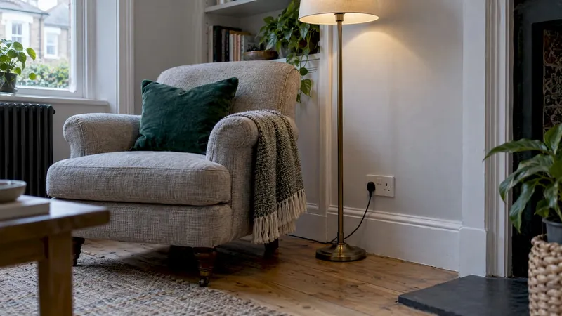
Finally, light is not only windows. Plan ceiling lights, lamps and sockets at the same time as furniture, so a reading chair is not stranded far from the nearest socket.
Open-plan spaces: zones without walls
Open plan gives you flow and sightlines, but it can also give you a single big room where nothing has a home. The solution is zoning: giving each activity a clear identity without building anything.
House Beautiful describes this as micro-zoning: distinct areas, each with a purpose, defined by layered rugs in a related palette, furniture placement and lighting, all without blocking sightlines. A Canadian interior design studio adds that rugs, pools of light and low storage or dividers can separate zones while preserving views across the space.
Some practical moves:
- Float the sofa. Pushing it against the longest wall may seem to save space, but designers point out it can leave dead voids and disconnected zones. Pulling it forward and angling it creates an intentional boundary.
- Use a console or low shelving behind the sofa as a soft divider that doubles as storage.
- Change the floor at the zone edge, or lay a rug. Our piece on how flooring choices affect flow shows how materials guide the eye and the feet.
- Plan acoustics. Open spaces carry sound, so soft furnishings matter. A soft furnishings plan helps you choose rugs, curtains and upholstery before the room is finished.
Smaller homes need extra care. NB Architects notes that compact homes have less room to absorb mistakes, and that even open layouts still need privacy, acoustic control and storage.
Home layout mistakes to avoid
These are the errors that crop up most often, along with the quick fix for each.
- Ignoring traffic flow. Walls and furniture are placed first, routes are an afterthought. Map daily movement paths before committing to walls.
- Getting furniture scale wrong. An oversized sofa or a bed that nearly touches the wardrobe makes a room feel smaller. Use scaled drawings or 3D software to check fit and door swings.
- Underestimating storage. Cramped, cluttered homes usually have too little storage in the wrong places. Give every room a storage allocation early, rather than hoping to fit it in later.
- Forgetting that doors swing. An inward-opening door can eat a whole corner of a small bathroom. Check swings on the plan, or choose sliding or pocket doors.
- Treating light as decoration. Dark corners cannot be rescued by furniture. Adjust the plan or the windows.
- Putting quiet and noisy rooms side by side. Rearranging at design stage costs nothing; sound insulation afterwards does.
- Designing only for today. Think about a growing family, a home office or an elderly relative. If extending is on the horizon, our UK home addition planning guide shows what to consider.
The common-sense summary of these points, from a space-planning guide for homeowners, is that ignoring traffic flow, misjudging furniture scale and skimping on storage are what lead to cramped homes. Mapping paths, allocating storage and testing with scaled drawings is how you avoid them.
Improve your plan without blowing the budget
Optimising a layout is one of the cheapest improvements you can make, because it happens before materials and labour are bought. A few principles keep it that way.
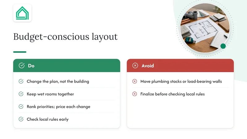
Change the plan, not the building, wherever you can. Moving a sofa or swapping a hinged door for a sliding one costs little. Moving a plumbing stack or a load-bearing wall does not.
Keep wet rooms together. It limits pipework, drainage and ventilation runs.
Rank your priorities. You will rarely get everything. Decide what matters most, whether that is a big kitchen, a quiet bedroom or a bright office, and let lower priorities flex.
Put a cost against each change. A layout tweak that adds a wall, a door or a window has a price. Compare it against what it improves before you commit.
Check local rules early. Some alterations, such as structural changes, extensions and changes affecting escape routes, may need building regulations approval or planning permission, and the position of windows and extensions can be affected by rules about neighbours. Rules differ between England, Scotland, Wales and Northern Ireland, and between countries worldwide, so confirm what applies with your local authority's planning and building control teams before finalising a design. A registered architect, structural engineer or building control officer is the right person to ask about walls, openings and structure.
Making layout decisions as a couple or a team
Layout choices are where couples most often discover they imagined different houses. One person pictures a big open kitchen, the other a separate room where cooking smells stay put. A contractor, meanwhile, is working from a drawing that may be three versions old.
A few habits help:
- Agree your non-negotiables separately, then compare. Each person lists their top five priorities for the plan. Overlaps are settled; differences are discussed with the drawing in front of you.
- Test with real routines. Each of you walks through a typical weekday on the plan and flags the points of friction.
- Keep one current version. Share one plan with contractors, with dates on each revision, so no one builds from an old drawing.
- Write down changes and their cost before work begins, so a casual "could we just move that wall?" is a conscious decision.
Our perspective
We built House A-Z for people who are doing this for the first time and feel the chaos of spreadsheets, scattered apps and conflicting opinions. A floor plan does not live alone: every layout choice touches the budget, the schedule, the products you pick and the people who build it.
That is why our platform brings budget tracking, room mapping, design suggestions and project management into one place, with AI agents that give personalised insight based on your budget, preferences and timelines, in plain language. Our aim is to help you spot costly mistakes while they are still lines on a screen, and to let partners and contractors work from the same plan.
A great layout is not luck. It is a series of small checks made early and made together, and we think every first-time builder deserves the tools to make them.
Azai
FAQ
What is floor plan optimisation?
It is the process of improving a layout so it works better in daily use. You test circulation, storage, light, privacy and zoning against real routines, then adjust walls, doors, furniture and room positions. Done before building or renovating, it is the cheapest time to make changes.
How much space should I leave between furniture?
A common guide is about 900 mm for main walkways and no less than around 600 mm for secondary gaps, such as beside a bed. Coffee tables usually sit 400 to 450 mm from the sofa. Widen these if you use a wheelchair or pushchair.
How do I make an open-plan room feel organised?
Divide it into zones with a purpose: a seating area, a dining area, a work corner. Rugs, lighting and low storage mark the edges without blocking sightlines. Floating the sofa away from the wall also helps define the space.
What are the most common space-planning mistakes?
Ignoring traffic flow, choosing furniture that is too large, and leaving too little storage are the usual culprits. Check them by drawing everything to scale and tracing your daily routes. Also check door and drawer swings.
Do I need permission to change my layout?
It depends on what you change. Cosmetic rearrangement rarely does, but structural walls, extensions and some openings may need building regulations approval or planning permission. Ask your local authority before finalising the design.
Sources
- Designing room by room, Building Performance (New Zealand)
- 7 Home Design and Layout Mistakes Everyone Makes, HGTV
- Space Planning Rules Every Architect Uses, Aaditya Interior
- Space Planning in Interior Design, Kaiko Design Interiors
- Guide to building reuse for climate action, AIA
- Passive Design Toolkit, City of Vancouver
- The Role of Vents in Airflow
- Micro-zoning open-concept living, House Beautiful
- Rethinking Open Plan Living, Linda Crammond Interiors
- Open Concept Living Room Layout, Modern Sense Furniture
- 9 Small-Home Layout Mistakes to Avoid, NB Architects
- Space Planning Principles Every Homeowner Should Know